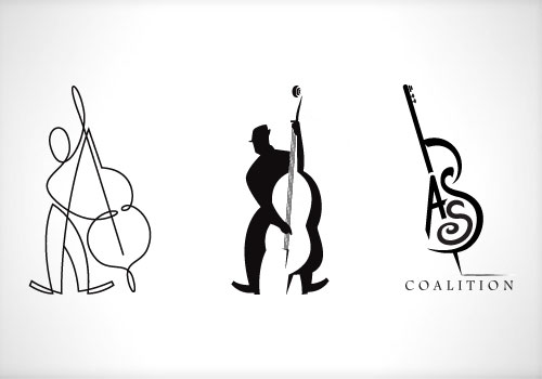
 For my second concept I decided to once again play with the negative space, by using the player to form the “empty” bass. He looked like some dude you’d see in a smokey club pluckin’ some jazz. Finally for my third concept I threw out the player and decided to feature the bass more prominently. by using the word to form the image.
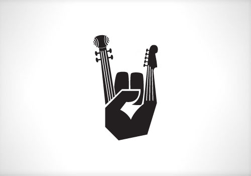
Feeling confident that I had covered at least one of my bass’ (the classical one . . . dah-dum-CHING) I decided to try a more edgy concept that would appeal to both types of players. Using the universal hand sign for “Rock and roll” I placed the necks of each bass on the hand. Classical on Mr. Pointer and electric on Pinky. I thought it was edgy, humorous and most importantly functional.

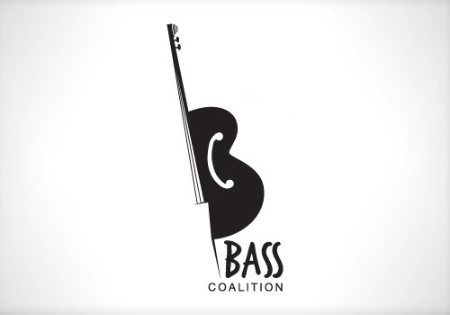
While the client agreed and liked it very much, it, along with the others, was ultimately rejected. However one of them did appeal with some tweaking. We took the third concept and replaced the word “bass” by filling it in with a solid image. By filling this in it not only formed half of the bass it also created the first initial “B” in the title. I added the initial “C” where the f-holes would originally be. This concept was ultimately approved.


Comments are closed.