The Souper Natural Kitchen was created to raise money to purchase fresh, local whole food to those in need in the community. Through a series of monthly SouperTuesday “soup” dinners, the community will have an opportunity to provide its financial support to those in need, get a terrific meal, a cooking class and connect with our local farmers.
The challenge they presented me with was to blend farm, fresh, soup and charity all into one logo. Below are just a few of the initial sketches.
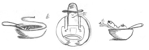
The client immediately fell in love with vegetable soup bowl (far right). Rather than create my usual smooth, streamlined logo which I’m partial too, I felt that this would look best if it retained it’s sketchy natural (organic) appearance. So I had to transform the clean smooth lines I had created in illustrator, into chunky, sketchy grungy ones.
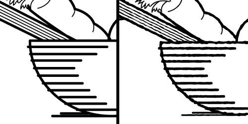
This was done using Illustrator’s “roughen” filter under Effect -> Distort & Transform. The size was set to almost nothing (.3) while the detail was set to 100%. Once I was happy with the results, it was time to apply some color. This time I didn’t want to do it in Photoshop. I wanted this logo to look sketched and watercolored, but to be completely vector. So I added strokes inside of each element and applied a watercolor brush to each one.
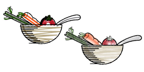
Once I was happy with the final results, I added in the text, applying the same technique used on the lines of the bowl. I started with a typewriter font, and roughened it up a bit.

The bowl was placed on top, and a checkered pattered was added around “kitchen” for the final, completed logo (below).
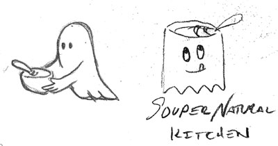
Just in case you’re wondering, yes, with a name like that I had draw up a few sketches just for fun.

Comments are closed.