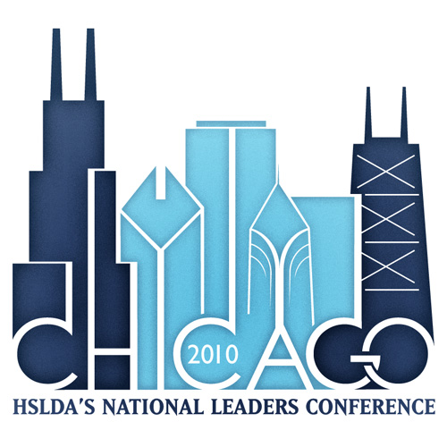
When I approached the design for the 2010 Leaders Conference host city logo, I knew almost immediately that I wanted to work Chicago’s unique skyline into it. After several failed, “Frankenstein-esque” attempts, I decided to form the letters from the negative space created between the buildings. This worked really well for the “H, I and A” since they have straight or angled lines, however the “C’s G and O” posed a problem. Adding depth and detail to the buildings allowed me to tie those into the curved forms of those letters, with the exception of the “O” which was left hanging out on the end. I decided the best option to tie it in with the rest of the logo was to “link” it with the “G”. I went with a cold color scheme to match the city skyscrapers and added a touch of “grit” and shading.

Comments are closed.