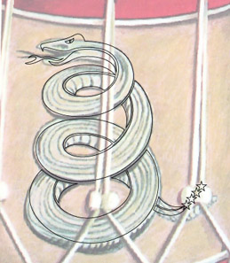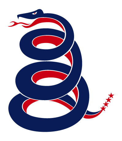
While trying to figure out how best to work in the second color I noticed the snake’s belly was a different element as the rest of the snake. While the top lines run the length of the snakes body, the lines on his belly run around the snake in the opposite direction. This gave me the idea to “break” the snake apart making a “top” and “bottom” allowing for the two colors, and since the “star” is a major element to their logo, I added stars to the tail to form the rattle.
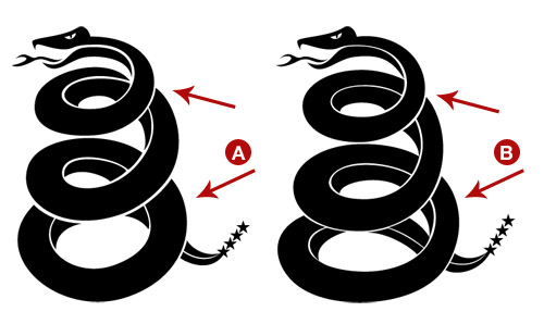
Once the initial illustration was done (A), I turned off the background layer and filled everything. I noticed that it looked a little bit like a spring jumping off the ground, so in order to make it look more like it was sitting on the ground, I “squashed” the bottom coil and brought the section before the tail into view. I continued to tweak different areas of the snake that formed Escher-esque impossibilities, like the point on the top portion just under the neck.

Once I was happy with the final illustration (B), I added in their logo colors.

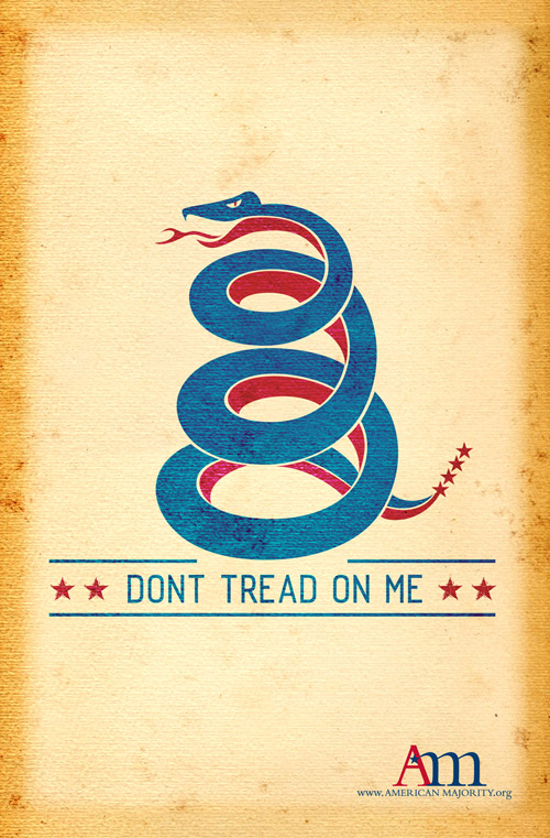
After color was applied, I brought it into Photoshop and placed it on a parchment background I had created for them on a previous job. I played around with different layer effects until I got the desired effect I wanted. Unfortunately, it shifted the colors so badly that I had to create a second background in greyscale to apply the snake onto. A layer mask was then added to hide the grey background and reveal the parchment. The words, and logo were then added to complete the poster.

Comments are closed.