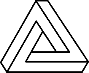
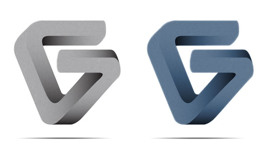
I rotated the triangle so that it was upside down, rounded all the corners, then “broke” the top bar apart, and added another bar to form the letter “G”. This was all done in Illustrator based off of my sketch.
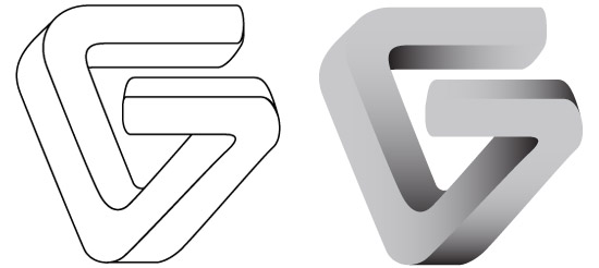
After the outline was completed, I added solid gray and applied gradient overlays to each section which helped to add more depth and dimension. Once completed in Illustrator I opened it in Photoshop to apply a brushed metal look. Noise was added, followed by a motion blur to each individual section in the correct direction. For the rounded corners separate radial blurs were applied, and layer masks were added to hide what was not needed.
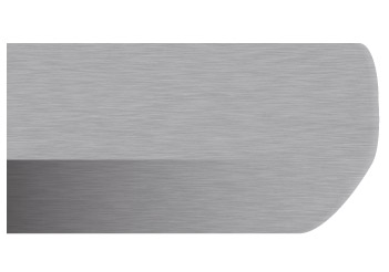
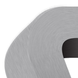
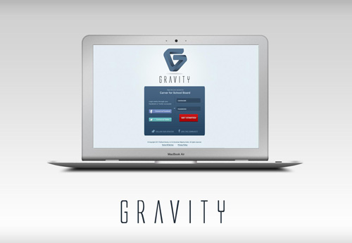
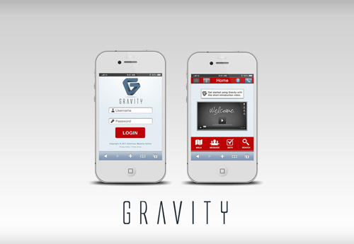
After all the corners were done, color was then applied and a shadow was added under it. Below are examples of how it’s being used.

Comments are closed.