Branding the Tea Party
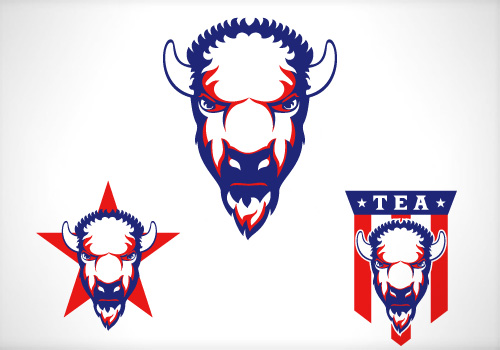
 The bison fulfilled both of these requirements and offered some real graphic possibilities. I wanted to do something completely different than the elephant and the donkey. Rather than an icon of a bison I decided to only illustrate the head (above). While the overall feedback was positive, the client rejected them. They felt that it better suited a sports team mascot. So if you’re a the owner of a team owner and you’re looking for a mascot and logo, hit me up, these are for sale. I went back and looked at the republican and democrat logos again and decided to match them a little more closely.
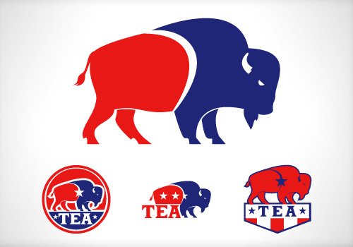
 These concepts were very well received. There was much discussion on whether it needed to read “TEA” or not. I felt it was important to add it since it represented a new and emerging movement. I argued it could be dropped once it had been out for a while, but ultimately the client decided to drop it. As we were finalizing everything I mentioned that I had created an additional concept but decided not to share it. Naturally, this piqued their curiosity and they asked if I would show it to them.
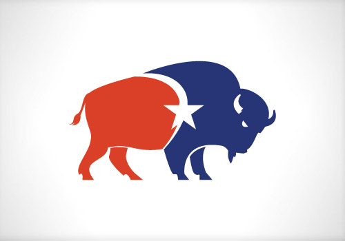
 Had I completely hated this concept, that would have been a very dangerous thing to say, but I actually really liked the mark. The only reason I left it out was because initial reaction from others had been confusion. They asked if it was a bull preparing to charge. The client however, absolutely loved it and did not see any confusion. In fact they preferred it’s aggressive look to the more passive one. This got the final approval. The colors were specifically chosen to represent both political parties. As I stated above I did not want this to be a republican or democrat logo, but rather a logo for the people. I placed the star in the middle to unify the colors and to represent the common bond we all share, whether democrats or republicans, and that is the spirit of America (are you tearing up yet?). You never thought a logo could say all of that did you? Will my bison ever stand along side of the elephant and donkey? I don’t know, it’s not likely, given our two-party system. But I was thrilled, and honored to work on the project and I’m proud of the results. But more importantly than all of that, I got paid.

