Orlando Logo

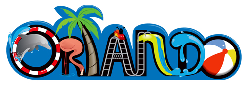
But there was one idea I kept coming back to. I had tried to avoid it because of the clichéd nature of it. I decided to give it a shot, after the first round concepts were rejected. After living in Orlando for almost a decade, I know first hand that it’s an inspiring city with lots of fun and entertaining elements to choose from. I wanted to capture the fun and excitement of the city but wasn’t sure which element to settle on, so I just decided to throw a different one in for each letter.
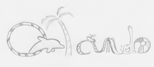
This concept unitized the different entertainment themed elements forming lower-case letters. I was most concerned about the readability of the “r”. With it being inside the “o” I was afraid people wouldn’t see it as a letter.
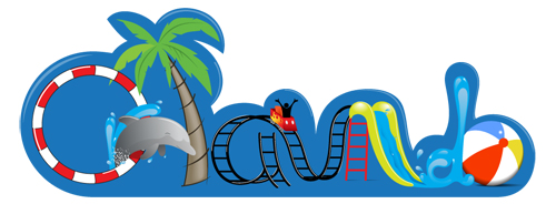
Once completed in Illustrator, I added a splash around the dolphin to emphasize the “r”. Even though I was very happy with the final result the client rejected it due to poor readability. When tested, people thought it read “Atlanta”. I still don’t see it, but if you’re reading this and you’re with the Convention Center and Visitor’s Bureau of Atlanta, this bad boy is available if you’re interested . . . of course, I’m only kidding. I wasn’t ready to completely give up on this concept, so I decided to change from lower-case to upper-case letters.

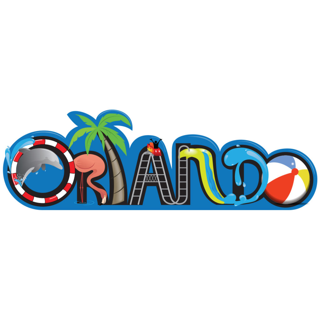
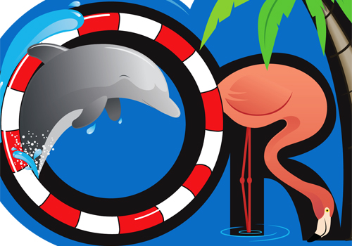
I scrapped the idea of using the dolphin as the “r”, but I couldn’t have the hoop without him so I moved Flipper to the top left and kept the splash. Now he was jumping more into the “o” as opposed to out of it. A flamingo would now form the letter r. With all the elements in place, I dropped black letters in behind the illustrations and placed it back on the blue field. This helped to make everything pop and poor readability was no longer an issue. This version received final approval.
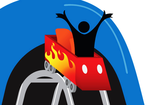
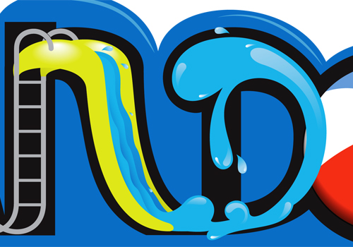
Here’s some close-ups of the different elements.
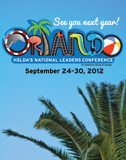
Here’s the logo in use on a promo poster.
