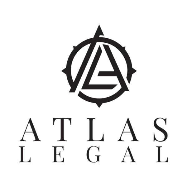
Relational Estate & Elder Law formerly Atlas Law
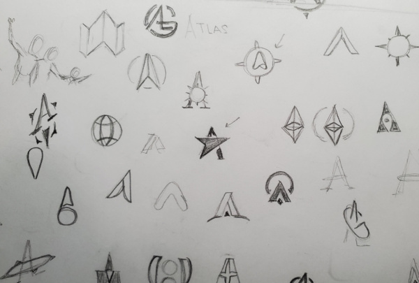
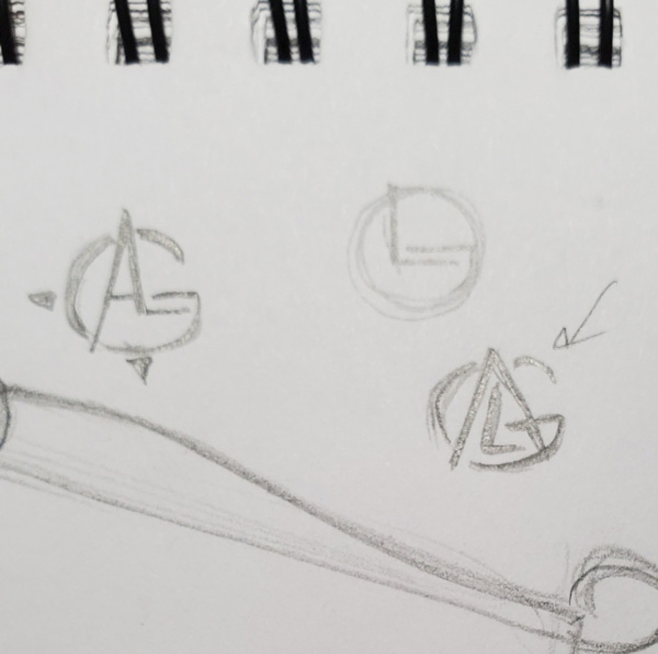
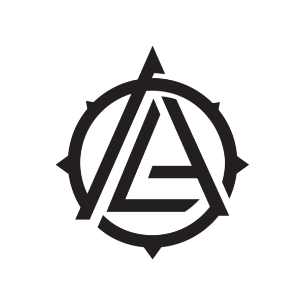
I felt it best to incorporate the firms initials into the logo, that’s when the magic happened. I presented 4 different options to the firm, making sure to place my favorite at the top. It was very well received, however by this time, they had already changed the name from Atlas Legal Group to Atlas Law. Now I had to take my encompassing (pun totally intended) letter G off. This was tricky because as I mentioned, the G brought it all together. The easiest solution was to just complete the compass, which the client loved. This was ultimately approved, and we began implementing the brand across all platforms, web and print.
About 6 months later, I received a call from the firm informing me that due to testing and feedback, they needed to change the name (again) to better reflect the team, their values and mission. However, this time it was more than removing one letter. This time they started from scratch, and decided on the name; Relational Estate & Elder Law and/or Relational Law. Obviously this required a complete redesign. I sent many different logos based on their initials, but there were two that caught their eye.
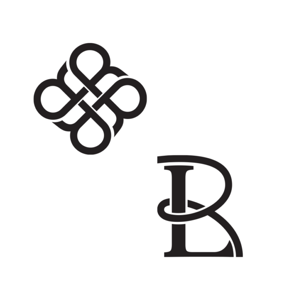
They really liked how the knot seemed to tie everything together in a relational way, and that it was made up of the letter “R” but felt it wasn’t refined enough. As for the other one, they liked how the “R” was looped around the “L” and wondered if there was a way to blend the two logos together. We went around for several more proofs until we both decided that it just wasn’t working. I decided to take a chance and send them something I had initially discarded, and the loved it!
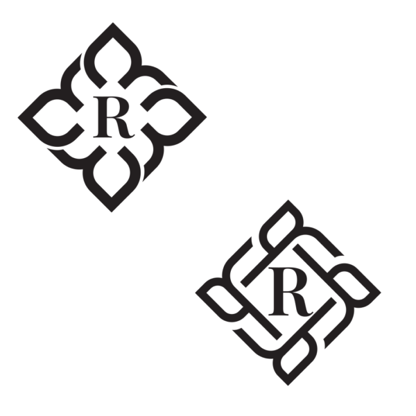
I added the inset lines on both the “R’s” and the diamond in the middle and they were sold.
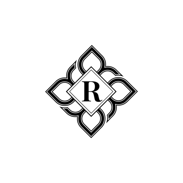
Relational Estate & Elder Law logo